
Color is one of the simplest tools we have for shaping how we feel. Without saying a word, color can calm the mind, lift energy, or help us refocus when emotions feel scattered. While color preferences are deeply personal, many people notice clear emotional shifts when they intentionally choose colors based on how they want to feel.
Coloring makes this especially accessible. With just a page and a few pencils, you can gently guide your mood—whether you need calm, clarity, or renewed energy.
Why Color Choice Influences Mood
Color affects mood through both psychology and physiology. The brain responds differently to various wavelengths of light, which can influence alertness, emotional tone, and even breathing patterns.
In simple terms:
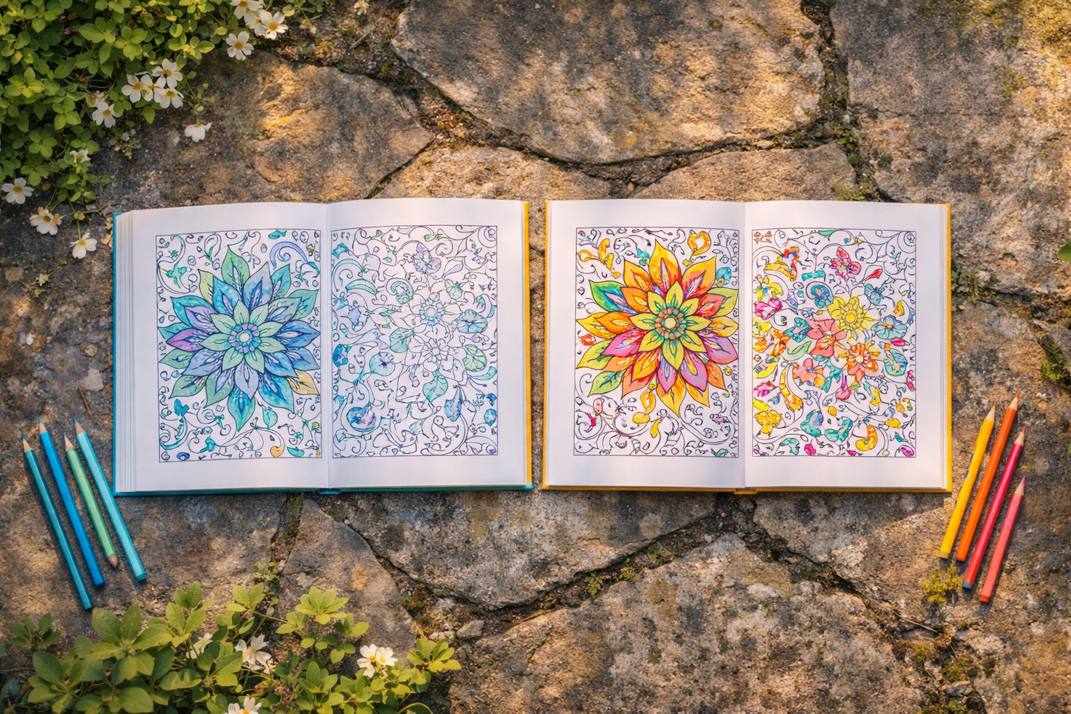
- Cooler tones tend to calm the nervous system
- Warmer tones tend to stimulate attention and energy
Understanding this can help make coloring feel more intentional and supportive.
Colors That Support Calm
When stress or overstimulation builds, calming colors can help restore balance. These often include:
- Soft blues: promote relaxation and mental clarity
- Greens: encourage restoration and stability
- Lavenders: support emotional quiet and reflection
- Neutral tones: reduce sensory overload
Coloring with softer palettes can help slow breathing, reduce tension, and create emotional steadiness.
Colors That Support Energy and Motivation
At times, the goal isn’t calm—it’s momentum. Energizing colors can gently stimulate focus and motivation without feeling overwhelming.
Examples include:
- Yellow: encourages optimism and alertness
- Orange: supports creativity and enthusiasm
- Warm pinks: foster emotional warmth
- Bright greens: feel refreshing and uplifting
These tones work especially well when energy feels low or motivation is difficult.
Balancing Calm and Energy
Many people find the most comfort in balance rather than extremes. Combining cool and warm tones in a single page can create both stability and movement.
This mirrors emotional regulation itself—calm doesn’t always mean stillness, and energy doesn’t always mean intensity.
Listening to What Feels Right
There’s no “correct” palette. Emotional needs shift throughout the day, and color choices often reflect this naturally.
Instead of asking what looks best, try asking:
- What feels calming right now?
- What helps me focus?
- What feels supportive today?
This awareness builds emotional insight over time.
Using Color as Everyday Support
Coloring becomes especially helpful during:
- Workday breaks
- Evenings after busy days
- Transitional moments between activities
Even short sessions can reset emotional tone.
Designed for Emotional Flexibility
At Sweet Pea Creative LLC, we believe creativity should meet people where they are. Through PeaChi Pages, we design coloring books that support both calm and energy—offering flexible tools for emotional well-being.
Sometimes the most supportive choice isn’t productivity or rest.
Sometimes it’s simply choosing the color that helps you feel steady again.


